
MASTER THE USE OF COLOURS IN YOUR HOME
Understanding Colour Theory and its application in Interior Design
Colour plays a crucial role in interior design, as it has the power to evoke emotions, create atmosphere, and influence the perception of space. To master the use of colours in your home like an interior design expert, it is essential to understand the fundamentals of colour theory and how it can be applied effectively in interior design.
Basic Principles of Colour Theory
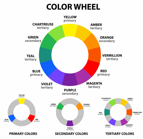
1. The Colour Wheel
A colour wheel is a fundamental tool in understanding colour theory. It consists of primary colours (red, blue, yellow), secondary colours (green, orange, purple), and tertiary colours (a mix of primary and secondary colours). Complementary and analogous colours can also be identified on the colour wheel.
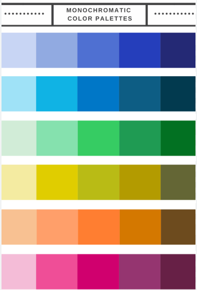
2. Colour Harmony
Colour harmony refers to the visually pleasing combination of colours in a room. There are various color schemes that can be used to achieve harmony, such as monochromatic, analogous, complementary, and triadic color schemes.
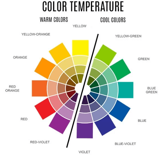
3. Colour Temperature
Colours can be classified as warm or cool based on their position on the colour wheel. Warm colours like red, orange, and yellow create a cosy and inviting atmosphere, while cool colours like blue, green, and purple evoke a sense of calm and serenity.
Application of Colour Theory in Interior Design
1. Creating Mood and Atmosphere
Different colours have the ability to evoke different emotions and set the tone for a space. For example, vibrant reds can energize a room, while soft blues can promote relaxation. Understanding how colors impact mood can help in creating the desired atmosphere in each room.
2. Emphasizing Architectural Features
Colours can be used strategically to highlight architectural elements in a space. Dark hues can add drama and depth, while lighter shades make a room more spacious. Using contrasting colours or shades allows specific features to be emphasized or downplayed as needed.
3. Establishing Visual Flow
Colour can also establish visual flow and cohesion throughout a home. By maintaining a consistent colour palette or using a progression of shades, transitions between rooms can feel seamless and interconnected, creating a harmonious overall design.
In conclusion, mastering the use of colours in interior design involves a deep understanding of colour theory and its application. By leveraging the principles of the colour wheel, colour harmony, and colour temperature, it is possible to create spaces that not only look visually appealing but also evoke the desired emotions and atmosphere.
Choosing the Right Colour Palette for Different Spaces in Your Home
When it comes to transforming your home into a visually appealing and harmonious space, selecting the right colour palette is key. Colors have the power to influence the atmosphere, mood, and overall feel of each room. As an aspiring interior design expert, mastering the use of colours in various spaces within your home will be essential. Here, we will delve into the art of choosing the right colour palette for different areas of your living space.
Living Room
The living room is often considered the heart of the home, where family and friends gather to relax and socialize. When selecting a colour palette for this space, consider shades that promote warmth and comfort. Earthy tones like warm beige, soft brown, and gentle greens can create a cosy and inviting atmosphere. Accent colours like navy blue or rich burgundy can be incorporated into furniture or decor pieces to add a touch of sophistication.
Bedroom
For the bedroom, it’s crucial to choose colours that promote relaxation and restful sleep. Soft and calming colours such as light blues, lavender, or muted greens are ideal choices. These colours can help create a serene environment conducive to winding down at the end of the day. Consider incorporating warm neutrals like creamy whites or soft greys to add a touch of cosiness.
Kitchen
In the kitchen, where functionality is key, the colour palette should reflect cleanliness and energy. Crisp whites, light greys, or pale yellows are popular for kitchen spaces as they promote a sense of cleanliness and freshness. Accents of bold colours like red or vibrant teal can be added through appliances or kitchen accessories to inject a pop of energy into the space.
Home Office
When designing a home office space, choosing colours that inspire focus and creativity is essential. Neutral tones like soft greys, warm beiges, or light blues can provide a calming backdrop for productivity. Consider adding pops of vibrant colours like mustard yellow or emerald green through artwork or decor items to stimulate creativity and motivation.
Bathroom
In the bathroom, creating a spa-like atmosphere can enhance relaxation and rejuvenation. Soft and soothing colours like pale greens, light blues, or soft greys can evoke a sense of tranquillity. To add a touch of luxury, consider incorporating metallic accents like gold or silver through fixtures or accessories to elevate the space’s overall aesthetic.
By carefully selecting the right colour palette for each space in your home, you can create a cohesive and harmonious environment that reflects your style and enhances the functionality of each room. Experimenting with different colour combinations and understanding the psychology of colours will enable you to master the use of colours in your home like an interior design expert.

Creating a Harmonious Colour Scheme Through Coordination and Contrast
In interior design, one of the key elements that can transform a space is the use of colour. Understanding how to create a harmonious colour scheme through coordination and contrast is essential for achieving a visually appealing and balanced home. By carefully selecting and pairing colours, you can create a cohesive and inviting atmosphere that reflects your style and enhances the functionality of each room.
Coordination of Colours
- Choosing a Dominant Colour: Start by selecting a dominant colour for each room. This colour will set the tone for the space and serve as the foundation for the rest of your colour scheme.
- Creating a Colour Palette: Once you have your dominant colour, choose a complementary colour palette that includes shades and tones that work well together. Consider using a colour wheel to find harmonious colour combinations.
- Balancing Warm and Cool Tones: In your colour scheme, aim to strike a balance between warm and cool tones to create a sense of harmony and visual interest.
- Using the 60-30-10 Rule: When coordinating colours, follow the 60-30-10 rule, which suggests using 60% of the dominant colour, 30% of a secondary colour, and 10% of an accent colour to achieve a well-balanced look.
Contrast in Colors
- Understanding Colour Contrast: Contrast in colours refers to the differences in hues, shades, and tones within a colour scheme. By incorporating contrast, you can create visual impact and depth in your design.
- Utilizing Light and Dark Contrasts: Experiment with light and dark contrasts to add dimension to your space. Pairing a light wall colour with dark furniture can create a striking visual effect.
- Textural Contrast: In addition to colour, consider incorporating textural contrast through different materials and fabrics. This can enhance a room’s overall visual appeal.
- Accentuating with Pops of Coluor: Introduce pops of colour through accessories, artwork, or decorative items to create focal points and add personality to your space.
By mastering the art of coordination and contrast in colour schemes, you can transform your home into a stylish and harmonious environment that reflects your design aesthetic and creates a welcoming atmosphere for you and your guests. Experiment with different combinations, textures, and accents to find the perfect colour scheme that resonates with you and complements your living space.
